By Dylan Anderson | 10 February, 2021
A few weeks ago, I tuned into an RStudio talk by John Burn-Murdoch about reporting and visualizing the COVID pandemic. As a data journalist at the Financial Times, he has been extremely influential over the past year creating well-known charts and graphics about the spread of COVID and it’s toll on the world. And it is all because his graphics tell a story.
As a consultant, I know the importance of storytelling, but doing it in programming is difficult as the story often gets lost behind the data. Still, you should always try to tell a story with your graphics, charts and plots, instead of just laying out some numbers and lines on a page. So how do you do this? Well, I had three main takeaways from his talk and my experience:
Use text - it’s your secret weapon and can be used in more than just the title
Consider the Emotional and Political Context - understand how your audience might look at your chart
Use animation intelligently - animated GIFs, charts and videos are helpful but should be used to underscore points in your story (note I am planning to do a second blog post specifically on this!)
In this tutorial, I want to explore the ggplot2 package in R, using functions like annotate and geom_vline to tell a political tale of Presidential Approval Ratings. I wrote about this before on Medium and on my website with a more in-depth political analysis.
We will build 5 graphs here, one combined plot of Presidential Approval Ratings from each president over the past 75 years and four plots of individual Presidential terms with text explaining major events in the presidency.
Step 1: Package & Data Loading
Let’s load the required packages and data in RStudio. I have included all the data on my GitHub repository or you can download it yourself from the Presidency project and FiveThirtyEight for President Trump’s approval ratings. Note I did manually clean some of the excel sheets for ease of use, so downloading from my Github might be easier.
if(!require("readxl")) install.packages("readxl") # Required to read in the data
if(!require("tidyverse")) install.packages("tidyverse") # Our rock in data analysis (includes ggplot2)
if(!require("janitor")) install.packages("janitor") # Cleans up data like no other package
if(!require("ggsci")) install.packages("ggsci") # Provides awesome color palettes

# Used a function found on stackoverflow to combine all the different sheets of an excel file into a list
read_excel_allsheets <- function(filename, tibble = TRUE) {
  sheets <- readxl::excel_sheets(filename)
  x <- lapply(sheets, function(X) readxl::read_excel(filename, sheet = X))
  if(!tibble) x <- lapply(x, as.data.frame)
  names(x) <- sheets
  x
}

# Combine the different sheets into one list of 13 dataframes
data.list <- read_excel_allsheets("data/PrevPresidentApproval.xlsx")

# Download the separate Trump approval dataset
trump.approval <- read.csv("data/TrumpApproval.csv")
Step 2: Data Manipulation
After loading the packages and the data the next step is data manipulation. For this, we want to label all the datasets, rename the columns and merge the two dataframes (one of the previous presidents and one of President Trump) after ensuring all their columns are the same, as they are from two different sources.
# Create a list with all the president's names
pres.names <- list("Obama", "BushJr", "Clinton", "BushSr", "Reagan", "Carter", "Ford", "Nixon", "Johnson",
                "Kennedy", "Eisenhower", "Truman", "Roosevelt")
# Apply the list to each dataframe in the original excel list
# This makes up for the sheet names, which originally had the president names
data.list <- Map(cbind, data.list, President = pres.names) # the Map function applies cbind to each dataframe of the list

# The Janitor package helps us clean the names, from which we select all the columns except for the polling start date (taking the end date instead). Then we rename the columns with the rename() function
df <- janitor::clean_names(bind_rows(data.list)) %>%
  select(-start_date) %>%
  rename(date = end_date, approval = approving, disapproval = disapproving, unsure = unsure_no_data)
df$date <- as.Date.POSIXct(df$date) # We need to change the value from POSIXct to Date

# Now let's clean the trump dataset to match the others and combine it into a new dataframe
# I always create new dataframes in case I want to re-access the earlier data without loading it all in again
trump.approval <- read.csv("data/TrumpApproval.csv")
trump.approval <- trump.approval %>%
  filter(subgroup=="Adults") %>% # I chose to take the all adults category as it is more representative of the country
  select(modeldate, approve_estimate, disapprove_estimate) %>%
  mutate(unsure =(100 - (approve_estimate + disapprove_estimate))) %>% # Create an unsure column
  rename(date = modeldate, approval = approve_estimate, disapproval = disapprove_estimate) %>% # rename the other columns
  mutate(president="Trump")
trump.approval$date <- as.Date.character(trump.approval$date,"%m/%d/%Y") # Change the date column from character to date format
df2 <- rbind(df, trump.approval) # Combine the data into a new dataframe df2
Step 3: Additional Data Requirements
Before graphing, we need to add in one more detail to make sure we are telling the proper story. This detail is the date each president starts their term. This allows us to create a continuous graph of presidential approval rates with vertical lines at each term start. Be careful of the details though, as not all presidents started on their allotted January 20th date!
# To properly graph these presidents together we need to create a separate vector with the term dates for each president
# To do this we group by the president, arrange the data by the date of the polling and use the slice function to cut off the first polling entry, which is likely in their first year of presidency. Then select the two columns we need (president & date)
term.dates <- df2 %>%
  group_by(president) %>%
  arrange(date) %>%
  slice(1) %>%
  select(president, date)

# Every president starts on January 20th, so grab the year of their first poll and change the term.date start to January 20th
term.dates$term.start <- paste0(substring(term.dates$date,1,4), "-01-20")

# But...note the three exceptions to this rule:
# Gerald Ford took over the August 9th, Truman on April 12th, and Johnson on November 22nd after Kennedy was assassinated
term.dates[6,3] <- "1974-08-09"
term.dates[7,3] <- "1963-11-22"
term.dates[13,3] <- "1945-04-12"
term.dates <- term.dates[,-2] # Get rid of the date column
df2 <- merge(df2, term.dates, by = "president") # Merge the term.start into the main dataframe using the merge function
df2$term.start <- as.Date.character(df2$term.start) # Turn the term.start into the date class
df2$days_in_office <- df2$date - df2$term.start # Calculate the number of days in office, which will be relevant for later work!
Step 4: Graphing The Combined Presidential Story
The first plot I will make is a combined plot of approval ratings for each president. To make it easy to read and interpret I add vertical lines at the start of each of their terms using the term.start column. I also use the annotate() function to include labels with each of President’s name at the top of the plot. In my opinion, this looks a lot better than a cluttered legend for this specific graphic. Finally, the subtitle and title are required to tell the story of the graph, so don’t forget to put some thought into those elements!
# For colors I use the simpsons palette from the ggsci package as you need a lot of colours for 14 different presidents!
my_colors <- pal_simpsons("springfield")(16)
theme_set(theme_bw()) # Set the overall graphing theme; bw is my favourite as it makes it easy to compare and has a blank background
combined.plot <- df2 %>%
  ggplot(aes(x = date, y = approval, color = as.factor(president))) +
  scale_color_simpsons() +
  geom_point(alpha=0.7) +
  geom_smooth(span = 1, alpha = 0.5) + # Adds a smoothed line to the graph, much more visually appealing than a standard line
  geom_vline(data = df2, aes(xintercept = term.start), linetype= 4, color = "black", size=0.5) + # match the xintercept with the term.start dates found in the dataframe you are using (df2)
  scale_x_date(limits = as.Date(c("1941-01-20","2021-01-20"))) +
  annotate(geom="text", x=as.Date.character(c("2004-6-01", "1990-6-01", "1979-6-01", "1996-6-01",
                                              "1958-6-01", "1975-6-01", "1966-6-01", "1962-6-01",
                                              "1970-6-01", "2012-6-01", "1984-6-01", "1942-6-01",
                                              "1948-6-01", "2019-6-01")), y=c(100), # The x and y depict where you want the annotations to be
           label=c('bold("Bush Jr.")', 'bold("Bush Sr.")', 'bold("Carter")', 'bold("Clinton")',
                   'bold("Eisenhower")', 'bold("Ford")', 'bold("Johnson")', 'bold("Kennedy")',
                   'bold("Nixon")', 'bold("Obama")', 'bold("Reagan")', 'bold("Roosevelt")',
                   'bold("Truman")', 'bold("Trump")'), angle = 45, # Angling the labels for effect
           color=my_colors[1:14], parse = TRUE) + # Using the my_colors vector we can match the lines and text annotations with the same color
  # Add in the labels and titles! use the \n to have the subtitle spill over into the next line
  labs(x = "Date",
       y = "Approval Rating",
       title = "Approval Rating By President over the Years",
       subtitle = "Presidential approval ratings have gone from a volatile rollercoaster like in Truman, Nixon \nor the tenures of both Bush's to a more stable, party-centric evaluation epitomized \nby Trump's term",
       color = "President") +
  theme(plot.title = element_text(face="bold", size =14),
        axis.title.x = element_text(face="bold", size = 12),
        axis.title.y = element_text(face="bold", size = 12),
        legend.position = "none")
combined.plot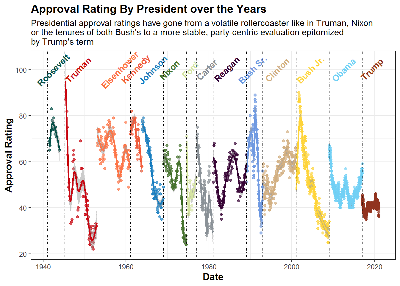
Three key lessons from this graph:
How to use
annotate()to replace a legend, placing the president names right above their statsMatch colors between the text and the graphed lines/ points in the plot to keep your reader in tune
Tell a story using the subtitle, especially if the title is a boring description of the graph
Step 5: Graphing Individual Presidential Approval Ratings
If you looked at my last post, you might notice individual presidential approval rating plots that include descriptors about major events in their presidency. This goes back to the first two points about storytelling: 1) Use text, and 2) Know your Audience. These graphs do wonders explaining why approval ratings rise and fall, without any additional captions, explanations or anything, all you need is the visual!
Below I will show you to graph a few of these past presidents, but feel free to make your own with any others.
So let’s start with Nixon’s graph with a few key moments:
nixon.plot <- df2 %>%
  filter(president == "Nixon") %>%
  ggplot(aes(x = date, y = approval, color = "green")) +
  geom_point(alpha=0.7, color = "green") +
  geom_smooth(span = 0.5, alpha = 0.5, color = "green") +
  geom_vline(xintercept = as.numeric(as.Date(c("1969-6-8", "1972-11-7", "1972-6-17", "1974-08-08", "1973-4-30"))), linetype= 4, color = "black", size=0.5) +
  labs(x = "Date",
       y = "Approval Rating",
       title = "Richard Nixon's Approval Rating over the Years",
       subtitle = "Nixon was a relatively popular president as he withdrew troops from Vietnam and was even able \nto get re-elected. As soon as he took responsibility for the Watergate though, there \ncontinued to be a steep decline in approval ratings") +
  annotate(geom="text", x=as.Date.character(c("1969-08-8", "1972-11-7", "1972-1-17", "1974-03-08", "1973-4-30")), y=c(40, 47, 40, 40, 65),
           label=c('atop(bold("Announces Plan to"), bold("Leave Vietnam"))', 'bold("Wins Re-Election")',
                   'atop(bold("DNC Headquarters Is"), bold("Broken Into"))', 'atop(bold("Nixon Officially"), bold("Resigns"))',
                   'atop(bold("Nixon Takes Responsibility"), bold("For Watergate"))'),
           color="black", parse = TRUE) +
  theme(plot.title = element_text(face="bold", size =14),
        axis.title.x = element_text(face="bold", size = 12),
        axis.title.y = element_text(face="bold", size = 12),
        legend.position = "none")
nixon.plot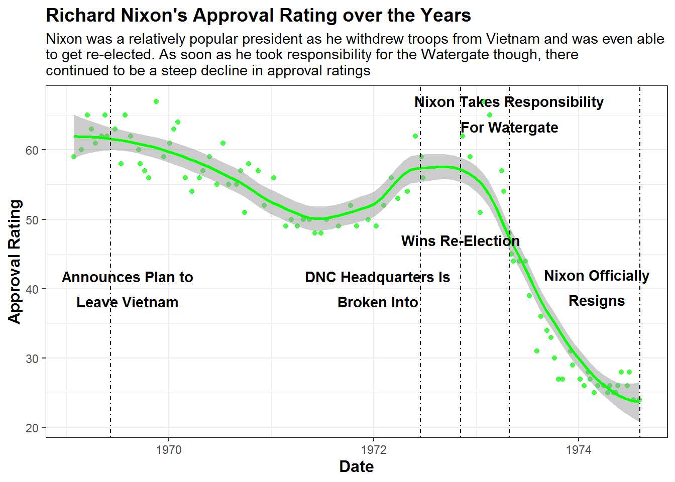
How about George W. Bush’s ratings? This one is really like a rollercoaster thanks to 9/11!
bushjr.plot <- df2 %>%
  filter(president == "BushJr") %>%
  ggplot(aes(x = date, y = approval, color = "red")) +
  geom_point(alpha=0.7, color = "red") +
  geom_smooth(span = 0.5, alpha = 0.5, color = "red") +
  geom_vline(xintercept = as.numeric(as.Date(c("2001-9-11", "2003-3-20", "2006-11-07", "2007-12-01"))), linetype= 4, color = "black", size=0.5) +
  labs(x = "Date",
       y = "Approval Rating",
       title = "George W. Bush's Approval Rating over the Years",
       subtitle = "Bush Jr. had an ever decreasing approval rating broken up by two jumps: \n1) Right after Sept-11th and 2) When he declared war on Iraq",
       color = "President") +
  annotate(geom="text", x=as.Date.character(c("2001-9-11", "2003-3-20", "2006-11-07", "2007-12-01")), y=c(40, 80, 60, 50),
           label=c('bold("Sept 11th Attack")', 'atop(bold("Iraq War"), bold("Declaration"))',
                   'atop(bold("2006 Mid-Term"), bold("Elections"))', 'atop(bold("Great Recession"), bold("Begins"))'),
           color="black", parse = TRUE) +
  theme(plot.title = element_text(face="bold", size =14),
        axis.title.x = element_text(face="bold", size = 12),
        axis.title.y = element_text(face="bold", size = 12),
        legend.position = "none")
bushjr.plot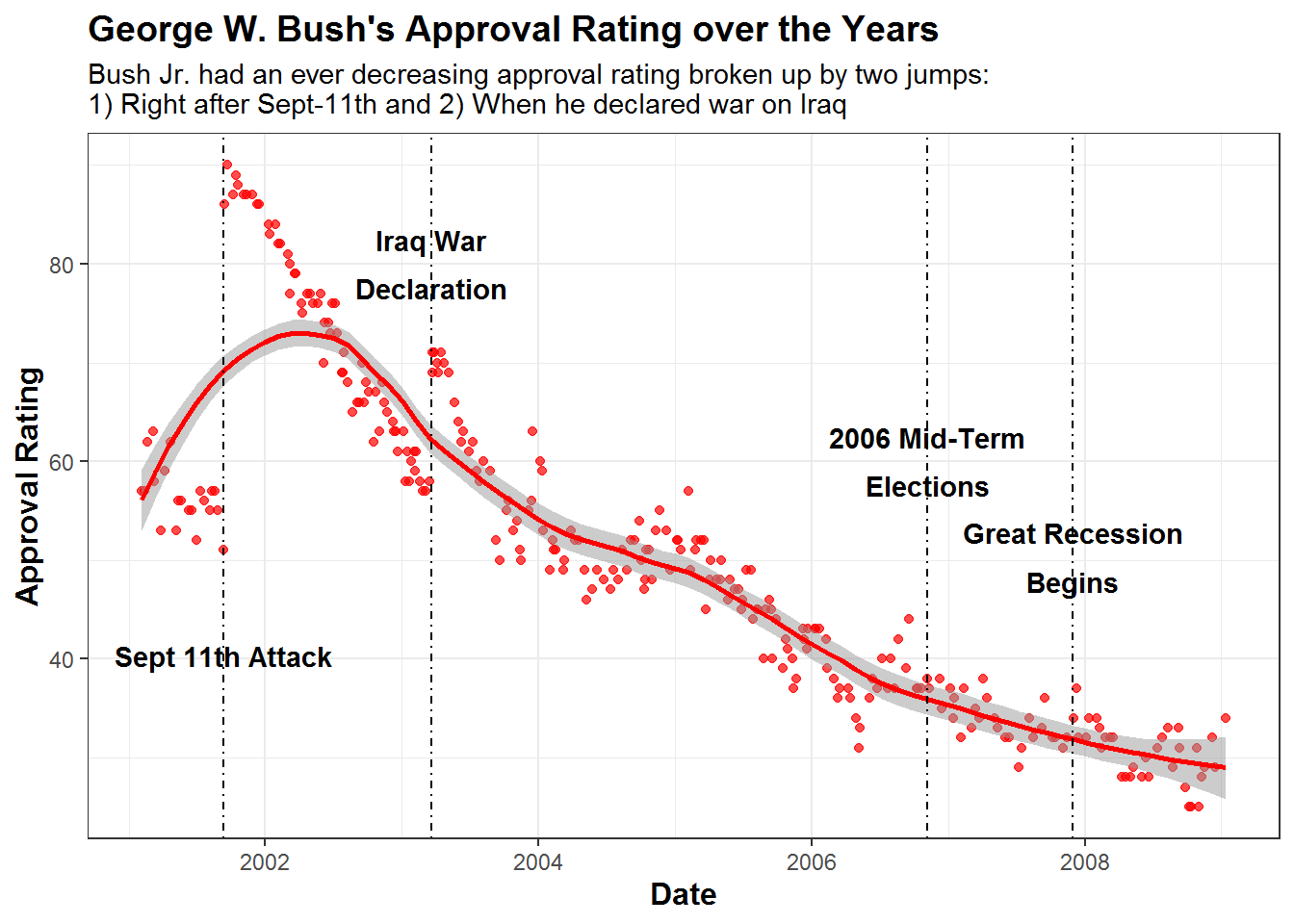
Let’s see how to graph the two most recent presidents now, Obama and Trump. As you can see, these are much more consistent and less volatile than all others, with major events not changing approval ratings all that much, especially for Trump.
obama.plot <- df2 %>%
  filter(president == "Obama") %>%
  ggplot(aes(x = date, y = approval, color = "blue")) +
  geom_point(alpha=0.7, color = "blue") +
  geom_smooth(span = 0.5, alpha = 0.5, color = "blue") +
  geom_vline(xintercept = as.numeric(as.Date(c("2010-3-20", "2011-5-2", "2012-11-07", "2015-03-2"))), linetype= 4, color = "black", size=0.5) +
  labs(x = "Date",
       y = "Approval Rating",
       title = "Barack Obama's Approval Rating over the Years",
       subtitle = "Obama's popularity peaked both times he was elected, showing his strong ability to campaign. \nHe also got a spike when Bin Laden was killed in 2011") +
  annotate(geom="text", x=as.Date.character(c("2010-3-20", "2011-5-2", "2012-11-07", "2015-03-2")), y=c(70, 60, 65, 55),
           label=c('bold("Passes ObamaCare")', 'atop(bold("Osama Bin Laden"), bold("Assasinated"))',
                   'bold("Wins Re-Election")', 'atop(bold("Clintons Email"), bold("Scandal"))'),
           color="black", parse = TRUE) +
  theme(plot.title = element_text(face="bold", size =14),
        axis.title.x = element_text(face="bold", size = 12),
        axis.title.y = element_text(face="bold", size = 12),
        legend.position = "none")
obama.plot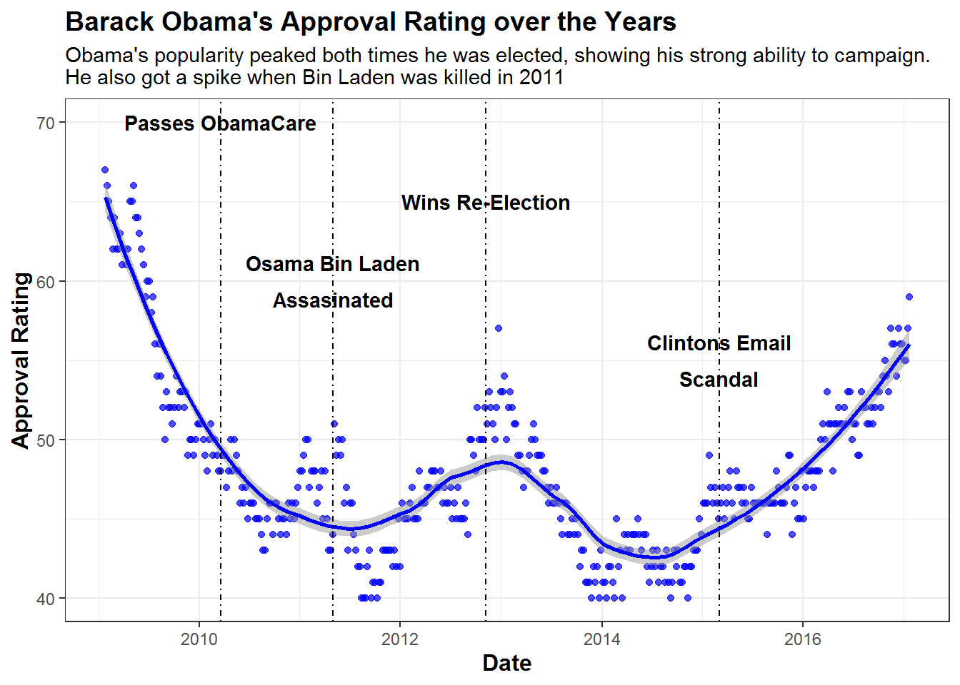
trump.plot <- df2 %>%
  filter(president == "Trump") %>%
  ggplot(aes(x = date, y = approval, color = "orange")) +
  geom_point(alpha=0.7, color = "orange") +
  geom_smooth(method = 'loess', span = 0.5, alpha = 0.5, color = "orange") +
  geom_vline(xintercept = as.numeric(as.Date(c("2017-12-22", "2018-11-6", "2019-12-18", "2020-03-25", "2021-01-6"))), linetype= 4, color = "black", size=0.5) +
    ylim(32, 50) +
  labs(x = "Date",
       y = "Approval Rating",
       title = "Donald Trump's Approval Rating over the Years",
       subtitle = "Trump's highest approval came at the beginning of the pandemic, and the lowest as he \nincited the 2021 capital riots. With a 12 point gap between the two, his approval rating \nwas fairly stable no matter what happened") +
  annotate(geom="text", x=as.Date.character(c("2017-12-22", "2018-11-6", "2019-12-18", "2020-03-25", "2020-11-20")), y=c(48, 45, 37, 47, 45),
           label=c('atop(bold("Trump Tax Cuts"), bold("Signed Into Law"))', 'atop(bold("Democrats Win Back"), bold("The House"))',
                   'atop(bold("First Impeachment"), bold("Begins"))', 'atop(bold("COVID Pandemic"), bold("Arrives"))',
                   'atop(bold("Storming Of"), bold("The Capital"))'),
           color="black", parse = TRUE) +
  theme(plot.title = element_text(face="bold", size =14),
        axis.title.x = element_text(face="bold", size = 12),
        axis.title.y = element_text(face="bold", size = 12),
        legend.position = "none")
trump.plot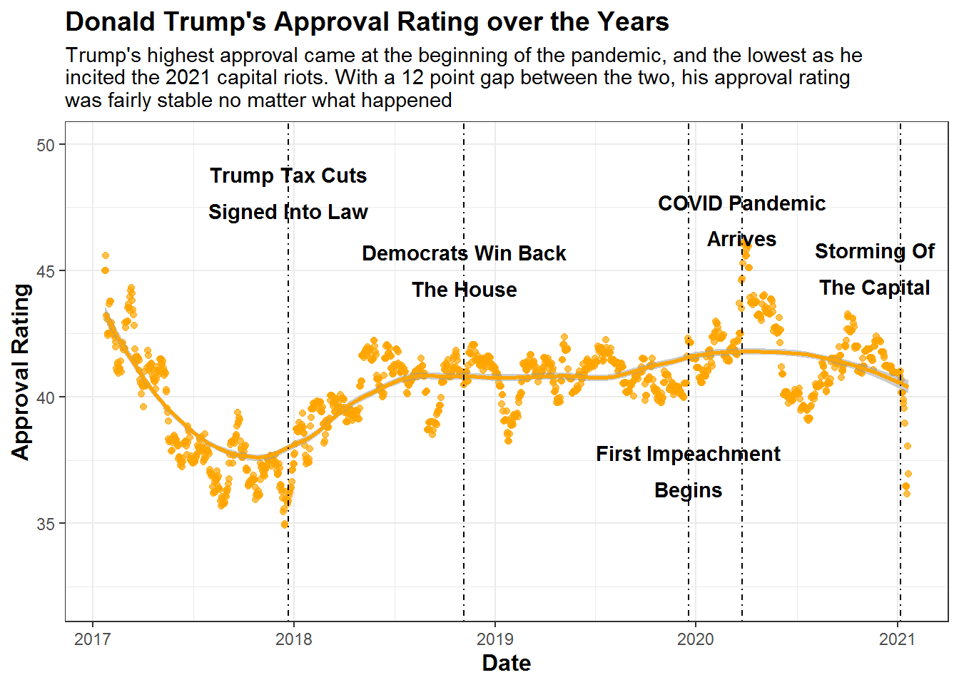
The beauty of these 4 plots is that you can actually understand why the dips and rises in approval ratings happened, linking the data to the story! This is so so so so so so so important for data scientists and analysts, especially in the business world where your boss wants to see one chart/ graphic to explain ten pages of analysis.
Thanks for reading and hope you learned something about storytelling, ggplot2 and using text in plots. While you can simply add this type of text overtop using PowerPoint or something, it becomes a powerful tool when you can automate it and figure out how to do it in your coding graphics in R.
If you enjoyed this, for my next post I plan to share how to animate these graphs using the gganimate and magick packages, creating cool looped gifs of each president’s first 4 years as president and their corresponding approval ratings. Follow my medium to learn more!
References:
[1] FiveThirtyEight, Donald Trump Approval Ratings, (2021)
[2] The American Presidency Project Presidential Job Approval, (2021)
I am a Simulation & Strategy Consultant at Monitor Deloitte, I use stats and analytics to inform Digital Twin models that re-invent the way companies approach strategic decisions. In my free time, I’m obsessed with politics and policy, blogging about it all the time at Policy In Numbers. You can find me there or at my LinkedIn and Twitter accounts (feel free to connect or give me a follow).