By Dylan Anderson | 25 February, 2021
In my last post, I demonstrated how you can create graphs and text that tell a nice story about how much the American public approved of each of the past 14 Presidents! So, how about we make the information more fun to watch?
Luckily, R can accomplish this. With the gganimate and magick
packages, GIF building is easy and effective. Let’s look at the end
result first, so I can reel you into making this for yourself.
This GIF shows Trump’s approval rating compared to the approval ratings
of every president in the past 75 years in an individual one-on-one
comparison. By using the Day in Office number on the x-axis we can
show how the approval ratings of each president differs from Trump as
they go from Day 1 to Day 1461 (the first four years, or first
Presidential term). While I compare Trump in this post/ tutorial,
you can replace the data with any other past President.
It’s worth noting that I build one other graph in this tutorial, but this is all to get you to understand the process of deciding when to animate and when not to animate.
Step 1: Package & Data Loading
As always, load the packages and the data. The main packages we will
use in this tutorial are the tidyverse (as always), gganimate and
magick. The gganimate package is great for animating your classic
ggplot graphs and plots. Meanwhile, magick is one of my all-time
favorite packages for improving your graphs, plots and pictures. In
this tutorial it allows us to change the size of the pictures, edit the
features and combine them into a long GIF.
In terms of the data, I draw specifically from the previous dataset I used in my last tutorial, but have included the days in office by president and the rolling approval (calculated from 5 consecutive data points). The data is cleaned and available at my Github repository, so I suggest downloading the csv file there!
if(!require("tidyverse")) install.packages("tidyverse") # Our rock in data analysis (includes ggplot2)
if(!require("ggsci")) install.packages("ggsci") # Provides awesome color palettes
if(!require("gganimate")) install.packages("gganimate") # Makes animating ggplot graphs easy!!!!
if(!require("magick")) install.packages("magick") # One of my favourite packages ever. All about editing pictures, plots and making GIFs like magic

# Load the data
df <- readRDS("data/CombinedPresidentialApproval.rds")
# The csv file is also there if you want
# df <- read.csv("data/CombinedPresidentialApproval.csv")
Step 2: Clean the data
Now for the most important part of any analysis, cleaning the data. When we look at the dataset, we notice the extensive amount of data points we have for Donald Trump. Since we will be comparing the first 4 years in office of each past president to him, we might want to cut down on the unnecessary noise, therefore making our dataframe faster to graph and animate.
So to clean the data we delete half of Trump’s approval data points by every other day. Then we select the appropriate columns to analyze, filter out all data points after the first four years and get rid of any rows that don’t have information.
# We will cut every other day from Trump's approval ratings (which is fair given the lack of variation in the approval rating)
df.trump <- which(df$president == "Trump") # Figure out what rows contain Trump's data
toDelete <- seq(1, nrow(df[c(df.trump[1]:df.trump[1459]),]), 2) + 1716 # Pick every other number and add back the number of rows before the Trump data (1716)
df <- df[-toDelete, ] # Delete the rows identified
rm(df.trump, toDelete)

# Cut df.days by only days in office, president and rolling approval & limit it to first 4  (less than 1461 days)
df <- df %>%
  mutate(days_in_office=as.numeric(days_in_office)) %>% # Turn the days in office to numeric
  select(president, term.start, days_in_office, rolling_approval) %>% # Select the columns you need for the animated charts
  filter(days_in_office<1461) %>% # Filger the days in office to bet the first 4 years (1461 days!)
  na.omit(df)
Step 3: How Should We Visualize?
The first step of visualization is figuring out the best way to do it. This is difficult and takes practice, thinking and LOTS of trying things out.
So if we are figuring out how to visualize the first four years of each
Presidents’ time in office, the first thing to do is try a line graph.
Here I am going plot all fourteen presidents on one ggplot graph.
# Let's try to plot the data to see how it shows up. For this I am just doing a simple ggplot
static.plot <- df %>%
  ggplot(aes(x = days_in_office, y = rolling_approval, color = as.factor(president),
             text = paste(
               "President: ", president, " - ", round(rolling_approval, digits = 1), "%",
               sep = "")
  )) +
  ggsci::scale_color_simpsons() + # Love this color palette because it has a ton of colors
  geom_line(aes(group = president)) +
  scale_x_continuous(breaks = c(0, 400, 800, 1200, 1600)) +
  labs(x = "Day In Office",
       y = "Approval Rating",
       title = "How have approval ratings changed by time in office within the \nfirst term?",
       color = "President") +
  theme(plot.title = element_text(face="bold", size =14),
        axis.title.x = element_text(face="bold", size = 12),
        axis.title.y = element_text(face="bold", size = 12),
        legend.title = element_text(face="bold", size = 12),
        legend.position = "bottom")
static.plot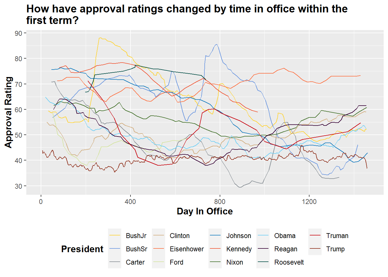
My reaction? Ouch! This graph is way too cluttered, hard to read and making me rethink how to tell the story of each President’s first 4 years…
Step 4: Animating This Data
As the previous plot showed, 14 presidents are way too many to showcase in one graph because it becomes very hard to compare when it is cluttered. Therefore, since I wanted to focus on comparing past presidential approval to Trump, I focus on creating plots with two lines (the president in question and Donald Trump). I will also animate it so you can see the progression difference between whichever president I’m comparing to Trump as time progresses. To do this, I create a function, a key part of coding in R!
The function does multiple things:
First, it creates a vector of all president names except for Trump. This allows us to create a loop and cycle through all the names of each president
Then, creates a loop that filters the data for Donald Trump and the president in question, and graphs the data. Trump approval ratings are shown in dark red and every other president is shown in dark blue.
We then use the
transition_revealfunction to animate each of these created plotsThen use the
animatefunction to change the size and animation settings for each plotThen create a new folder and save each animated plot there
The
forloop will do this and create an animated plot for each President in the initial vector
Tada you have 12 animated plots of the first four years of each Presidency in the past 75 years! It is also worth noting that this function takes a few minutes to run, so please be patient.
# Note that this function takes about two minutes to run on my machine. You can play with the frame rates, number of frames and the sizes as well to make it faster/ slower
president_linecharts <- function(x) {
# Vector of president names except Trump
compare_presidents <- unique(x[order(x$term.start),]$president)[-c(1,14)]
# A loop to produce ggplot2 graphs
for (i in seq_along(compare_presidents)) {
# make plots; note data = args in each geom
plot <- x %>%
filter(president=='Trump' | president==compare_presidents[i]) %>%
ggplot(aes(x=days_in_office, y=rolling_approval, group=president, colour=president)) +
geom_point(aes(group = seq_along(days_in_office)),
size = 1, alpha = 1, show.legend = FALSE) +
geom_line(size = 2, show.legend = FALSE) +
scale_color_manual(values = c("darkblue", "darkred")) +
scale_x_continuous(breaks=c(200, 400, 600, 800, 1000, 1200, 1400)) +
ylim(0,100) +
labs(x = "Day in Office",
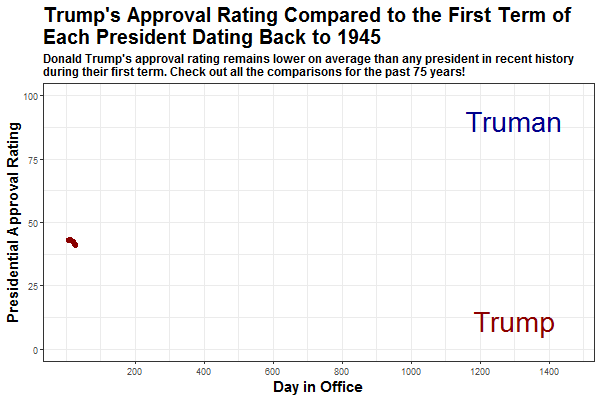
y = "Presidential Approval Rating",
title = paste0("Trump's Approval Rating Compared to the First Term of \nEach President Dating Back to 1945"),
subtitle = "Donald Trump's approval rating remains lower on average than any president in recent history \nduring their first term. Check out all the comparisons for the past 75 years!") +
annotate(geom="text", x=c(1300, 1300), y=c(10,90),
label=c("Trump", compare_presidents[i]),
color=c("darkred", "darkblue"),
size = 10, fontface = 'bold', parse = TRUE) +
theme_bw() +
theme(plot.title = element_text(face="bold", size = 20),
plot.subtitle = element_text(face="bold", size = 12),
axis.title.x = element_text(face="bold", size = 15),
axis.title.y = element_text(face="bold", size = 15),
legend.position = "none")
# Animate the plot
animated.plot <- plot +
transition_reveal(along = days_in_office)
# Adjust the animation settings
animate(animated.plot,
width = 600, # 900px wide
height = 400, # 600px high
nframes = 30, # 30 frames
fps = 10) # 10 frames per second
# create folder to save the plots to
if (dir.exists("animations")) { }
else {dir.create("animations")}
# save plots to the 'output' folder
anim_save(filename = paste0("animations/",
compare_presidents[i],
"_comparison.gif"))
# print each plot to screen
print(plot)
}
}
president_linecharts(df)Step 5: Combining the GIFs
This final part took me hours to figure out! How do you combine multiple GIFs into one?
Well, after creating a list of all my new animated plot files, I read in
each animated plot GIF using the image_read function by order of when
the President served (so from Truman to Obama). After reading them in,
we combine the GIFs using the image_join function and save the
overall output.
This is the key part and what I learned after hours of research. Because a GIF read into R is pretty much a dataframe, you can just join it like normal and it will run continuously. It is worth noting that the titles will remain the same as the first plot, so that is why they don’t change and why I include the names of the presidents in the graph instead of in a legend.
# Create a list of all the animation files in the "animations" folder
gif_list <- list.files(path="animations", pattern = '*.gif', full.names = TRUE)
gif_list

# Read in each gif from the folder by order of year (Truman to Obama)
# I did this manually, although I'm sure there is a way to automate it...
gif1 <- image_read(gif_list[12])
gif2 <- image_read(gif_list[5])
gif3 <- image_read(gif_list[8])
gif4 <- image_read(gif_list[7])
gif5 <- image_read(gif_list[9])
gif6 <- image_read(gif_list[6])
gif7 <- image_read(gif_list[3])
gif8 <- image_read(gif_list[11])
gif9 <- image_read(gif_list[2])
gif10 <- image_read(gif_list[4])
gif11 <- image_read(gif_list[1])
gif12 <- image_read(gif_list[10])

# Combine all the animated plot GIFs into one, in order of service date
presidential_approval <- image_join(gif1, gif2, gif3, gif4, gif5, gif6,
                                    gif7, gif8, gif9, gif10, gif11, gif12)
# Call your new GIF
presidential_approval
# Save your new GIF!
image_write(presidential_approval, path = "presidential_approval.gif")
And there you have it! That is how you create multiple animated plots of data and combine them into one longer GIF. Feel free to change up the data and the animation settings and have fun with how the GIF turns out.
For my next two posts, I will be: 1) looking at doing a sentiment analysis of Robinhood by scraping Twitter during the GameStop scandal; and 2) evaluating/ visualizing Joe Biden’s executive approvals in his first month on the job. If that interests you, give me a follow and I will see you again in the next few posts!
References:
[1] FiveThirtyEight, Donald Trump Approval Ratings, (2021)
[2] The American Presidency Project Presidential Job Approval, (2021)
I am a Simulation & Strategy Consultant at Monitor Deloitte, I use stats and analytics to inform Digital Twin models that re-invent the way companies approach strategic decisions. In my free time, I’m obsessed with politics and policy, blogging about it all the time at Policy In Numbers. You can find me there or at my LinkedIn and Twitter accounts (feel free to connect or give me a follow).